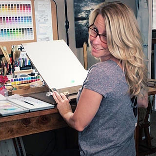
Tools of the trade
- Buffy Kaufman
- Oct 30, 2025
- 5 min read
Updated: Feb 24
Tools of the Trade: My Watercolor Essentials
From choosing color to the tools and surfaces I use, each element is placed and organized with intention. Once everything is ready, I can let go and dive into an expressive painting session. Having the right tools for the job makes all the difference. Here’s a peek into my favorites and why I reach for them every time.
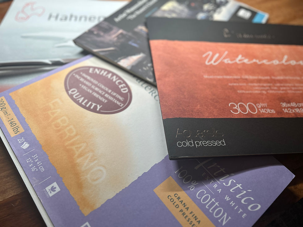
Paper: The Foundation of Every Pour
The right paper makes all the difference. I prefer 100% cotton watercolor paper in cold, soft, or rough press. After testing countless brands, I’ve found that each responds differently to wet techniques like pouring. Hahnemühle’s The Collection series is a wonderful all-around choice, performing beautifully with a wide range of techniques. For soft, ethereal paintings, I love using Hahnemühle Expression or Fabriano Artistico Soft Press. When I want to highlight granulation, I reach for rough press paper.
For quick studies, class demonstrations, or plein air sessions, 140 lb paper is ideal because it dries quickly. For larger, more detailed show pieces, I prefer 300 lb paper, which stays flat and resists warping even under heavy washes.

Paper & Support Boards
For quarter sheets or smaller, I tape my paper to a Robax or dry erase board. For larger paintings, I use Otto stretcher boards, wetting the paper first and securing it taut with the wooden stretchers to minimize warping. Stretching watercolor paper is a simple step that makes a big difference—once the paper is wetted, secured, and fully dried, it stays perfectly flat, allowing heavy washes to glide on smoothly without buckling.

Pigments: Bringing Your Paintings to Life
I use Daniel Smith Watercolors. With over 270 colors in the Daniel Smith range, it is an endless library of pigments to study and explore, I love unlocking combinations that seem to paint themselves.
For watercolor pouring, I reach for staining colors from the Phthalo and Quinacridone families. These smooth-mixing, staining hues stay in place once dry, making them ideal for layered pours. I often mix them with Hansa Yellows to create vibrant, balanced secondary colors. The Hansa, Phthalo, and Quinacridone combinations sing without becoming muddy.
For added texture and movement, I love pairing granulating pigments. Some of my favorite “dynamic duos” are Lunar Earth and Lunar Blue, French Ultramarine and Transparent Red Oxide, Bronzite and Kyanite Genuine, and Enviro-Friendly Brown Iron Oxide with Rose of Ultramarine. These combinations react in pours like performance art—their blends and separations create exciting textures, while the merged neutrals bring a beautiful sense of balance.

Palettes: Organized & Personalized
I use the Meeden 33-well plastic palette while teaching. I love that I can fill some wells while still having room to mix small puddles of color in the empty wells. It’s inexpensive, well-built, and even has space for stickers to personalize it. Curating colors and building palettes is a true passion of mine, and I’ll share more about customized palettes in future posts.

Ramekins
Ramekins, or pour cups, are ideal for mixing and pouring colors. In the studio, I use ceramic ramekins from Sawyer Ceramics, set in Richeson muffin palettes. For classes or plein air sessions I prefer melamine ramekins because they’re unbreakable and travel-ready.

Pipettes: Controlled Chaos
Pipettes are a must-have in my practice. I use them to drop in color, guide pours, or create lively splatters. They give me control, directing the color without restricting its natural movement.
When filled with masking fluid, I often “sketch” tree limbs or delicate floral centers with these plastic pipettes. Splattered, it creates an atmospheric effect, as if pollen or dust is floating in the air.

Continuous Spray Bottle: Mist, Flow, Rescue
A continuous spray bottle produces a fine, consistent mist that rewets drying edges, softens transitions, and extends the flow of paint. It also serves as a rescue tool, gently lifting pigment so I can correct and rework areas without disturbing the rest of the painting.
I always use two jars of water. One holds clean water for mixing pure pigments, while the other contains dirty water for rinsing brushes, adjusting saturation, or wetting paper so I can clearly see which areas are wet.

Angle: Guiding the Flow
I usually slant my board on risers to give it a gentle angle, letting gravity guide the pigment across the paper. Even the slightest shift in angle can completely change how colors dance and settle.
The risers by Acurit are stackable, while the sweet donut-shaped ones are a custom creation by Crochet Carol.

Masking Fluid & Tape: Preserving Whites
Winsor & Newton Colourless Masking Fluid dries clear, letting the underlying layers peek through. For painting on the go, I prefer Daniel Smith’s travel-ready version with its handy plastic tip, which makes application smooth and easy. To secure or mask paper, I use Blick Masking Tape—it grips firmly without tearing the watercolor paper.

Brushes: Paint Partners
I prefer synthetic brushes for wet-on-wet techniques because they hold paint without flooding the surface, are made without animal sourcing, and are more affordable than natural hair brushes. Some favorites include Rosemary & Co’s 304 Pointed Rounds, 310 Angle Shaders, and 413 Mock Badger Mottler, as well as the Paul Weaver Freestyle Brush, an extra-large all-in-one brush I sometimes use to complete an entire painting. I also enjoy Jackson’s Art Raven Mops and Icon Flats—their black-and-white minimalist handles are elegant, and the bristles are a joy to paint with. For detail work, I like snappy synthetics such as the Escoda Barroco and Silver Ruby Satin brushes.

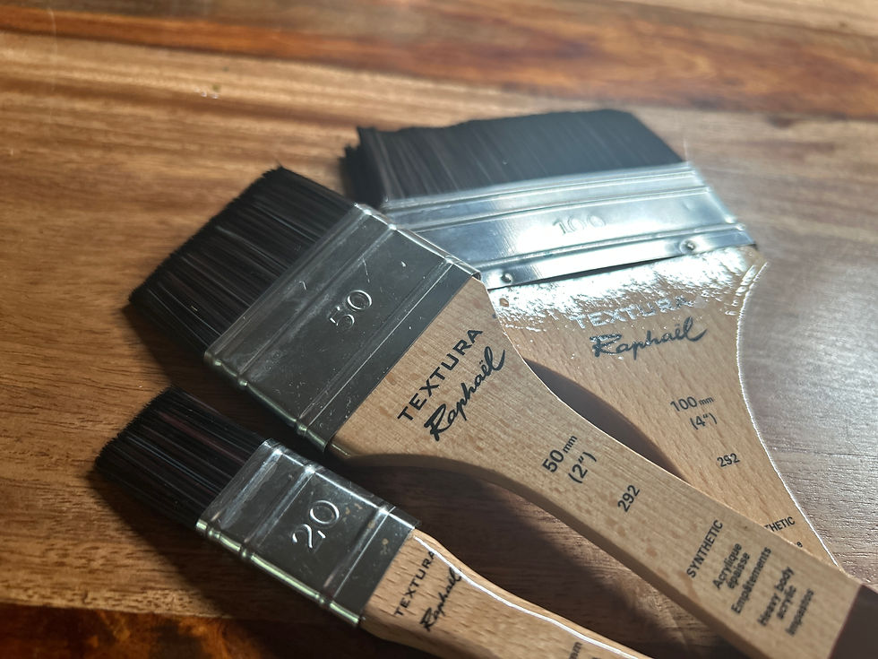
Lifting: Revealing Light
Lifting is a powerful technique in watercolor. Recently, I discovered the Raphael Textura brushes, which have quickly become my favorite for lifting. Their unique bristle design gives precise control and makes detailed lifting much easier, while also being gentler on the paper than traditional toothbrush scrubbing.

Stencil Lifting: Custom Patterns and Highlights
Stencil lifting is a technique for adding subtle patterns and light effects. I custom design and cut my own stencils, which allows me to create shapes perfectly suited to each painting. By placing a stencil over the painted surface and gently lifting the pigment underneath, I can reveal highlights and shapes that enhance the composition. I can also direct paint and spray over the stencils, using both positive and negative effects to add depth and texture.

In Closing
Watercolor is about balancing control and freedom. The tools that support my work – quality cotton paper, carefully chosen brushes, pigments, and masking fluids – all play a role in the process. Masking techniques and stencil lifting help preserve highlights, refine areas, and create subtle patterns. Pipettes and continuous spray bottles provide control while still allowing the paint to move naturally. If any of the supplies mentioned in this post caught your eye, be sure to check out the quick links below.
I’d love to hear about the tools and techniques you use – share your favorites in the comments and let’s keep exploring watercolor together.
Quick Links:
Watercolor Amazon *Affiliate Art Page: https://www.amazon.com/shop/watercolorpour/
Rosemary & Co. *Affiliate Link: https://www.rosemaryandco.com?u=BUFFY2024
Use code BUFFY2024 at checkout — thank you for supporting my work!
Buffy Brushes - my curated set https://www.rosemaryandco.com/wishlist/index/index/wishlist_id/300870/
Meeden *Affiliate Link: https://www.meedenart.com/WATERCOLORPOUR
Use code WATERCOLORPOURS for a 12% discount!
Jackson’s Teacher Page: https://www.jacksonsart.com/techniques/artists-workshops/buffy-kaufman
Otto Stretcher Boards: https://ottoartproducts.com
Robax Board: https://www.robax.com/palettes.html
*Affiliiate links? I earn a small commission if you make a purchase—at no extra cost to you.


Buffy you have one of the few palettes where I can almost use all the colors. I don't use anything that harms animals or is considered toxic. The only color I can't use is Sepia because it is one of the few Daniel Smith colors that are made with bone black.
I might have to end my color buying moratorium to get a couple of the ones I don't have 😂
Have you tried the Rosemary & Co's Red Dots. I was wondering how they compare to the 304's and the silver satins.
Finally, I love your work!!!