From Dots to Dreams
Updated: Sep 4
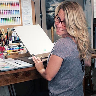
Hi! My name is Buffy Kaufman, and I am a watercolor pour artist from California. I’m excited to share how six core colors eventually led me to a palette filled with 16 incredible custom color mixes!
I began with a limited palette of colors that I knew would get along well together. The Hansa, Quinacridone, and Phthalo families blend together effortlessly, such a wonderful place to begin! My original limited palette is nicknamed the Limitless Palette:
Hansa Yellow Light (HYL)
Quinacridone Sienna (QS)
Quinacridone Red (QR)
Quinacridone Magenta (QM)
Phthalo Turquoise (PT)
Phthalo Blue Red Shade (PBRS)

From these six colors, I could mix and blend the colors of nature, from rich neutrals to muted pastels to bold brights. I spent a lot of time swatching, mixing, pouring, and simply getting to know how these colors behaved together.

Having a harmonious palette when using watercolor pouring and wet-into-wet painting techniques is very important to me. How colors blend and mix, how they behave through consecutive pours and glazes, and how they change as they are diluted are all essential considerations. Watch :Daniel Smith "Limitless" Watercolor Palette

As my color exploration continued and I became a Brand Ambassador for Daniel Smith, I expanded my palette to 18 colors. These became the 18 colors in my DANIEL SMITH Dot Card.

I divided the colors into strategic columns for ease in teaching. The first column became my Smooth Mixers. They each stain and remain when poured and are beautiful in glazes and mixes.
Hansa Yellow Light (HYL)
Quinacridone Sienna (QS)
Quinacridone Red (QR)
Quinacridone Magenta (QM)
Phthalo Turquoise (PT)
Phthalo Blue Red Shade (PBRS)
The second column I call the Granulating Cousins includes colors similar in hue but more earthy and granulating, offering a bit of grit I can't achieve through color mixing alone.
Raw Sienna Light (RSL)
Transparent Red Oxide (TRO)
Enviro-Friendly Brown Iron Oxide (EFB)
Rose of Ultramarine (ROU)
Prussian Green (PG)
French Ultramarine (FU)
And then there are the Magic Mixers! These colors in the third column each offer something special. The granulating spread of Payne’s Gray, the gorgeous settling sediment of the Lunars, the pepper-like texture of Sepia, and the natural, gorgeous sparkle of Bronzite and Kyanite Genuine.
Bronzite Genuine (BG)
Lunar Earth (LE)
Sepia (S)
Payne's Gray (PNG)
Lunar Blue (LB)
Kyanite Genuine (KG)
Each row works analogously, while each column behaves differently. Together, they combine endlessly, creating a palette filled with colors that get along!
Having those 18 colors to explore opened up even more possibilities. Each performs beautifully as a stand-alone color, but I especially enjoyed discovering how they worked together.
As I developed favorite mixes and combos, I began pre-mixing them during palette fills.
Rather than always starting with individual pigments, my palette is now full of favorite mixes ready to go, pre-mixed for consistency and convenience. I know what they will do, how they behave when diluted, and can reach for them when I want that particular color combination in a painting.

My palette has continued to evolve as I paint, experiment, and continually discover new combinations. To think it all started with those six core colors! From a dot card to following my watercolor dreams!

Swatching, exploring, and adventuring with color has opened doors and created connections that I never could have imagined. So thankful to the team at Daniel Smith for inviting me to create a Dot Card. Who knew being called to task would lead me to my all-time favorite palette of colors! Watch: Watercolor Swatch Book!


If you're inspired to create your own palette, try starting with a limited group of colors that you really enjoy. The Hansa, Quinacridone, and Phthalo families are so much fun to explore and study. You may be surprised at just how far a few colors can take you!

Enjoy posts like these?
❤️ Like ⭐ Rate 💬 Comment
Thank you for being here!

I’ve been a follower of yours ever since I saw one of your pours a few years ago on YouTube. Infact I have all of your favorite colors in a dedicated palette. Mixing some colors together, colors I never would have thought about pairing together, has helped me to be a little more adventurous! And when I do play with pairing colors like that, I make a point to writing them down alongside of the results. So I can use them in a painting.
You opened a whole new vista for me! Instead of buying every available color searching for just the right color (and always being a bit off) I can use a more disciplined, yet more creative, approach. Who knew so many colors really existed!